Sad to say, but most people don’t read full newspaper stories. They might look at the headline. They might even read the first few paragraphs until they get bored.
As a result, charts are important. So here are a few (some already used in past posts) to give people who won’t read in depth something to mull.
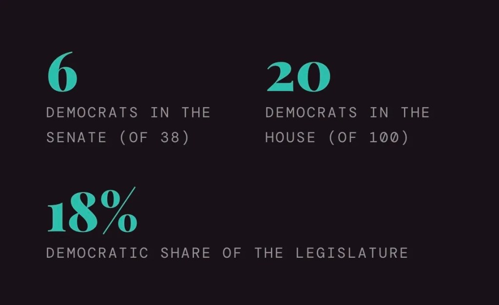
The chart at the top of this post shows the political makeup of the Kentucky State Legislature. Bills passed by the GOP are going to cause even more pain.
Then there are the charts below that extend throughout the nation:


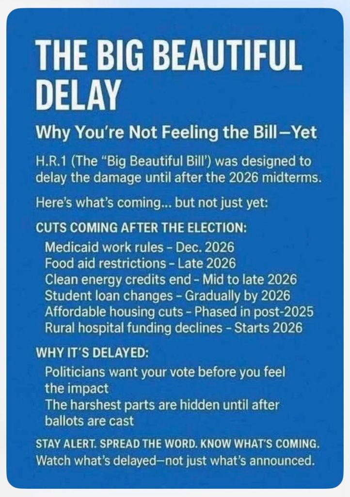
All of these atrocities are tied to the Republican Party. The people who voted for the party in the last election and are feeling the pain caused by these actions have a chance to remedy the suffering in November.
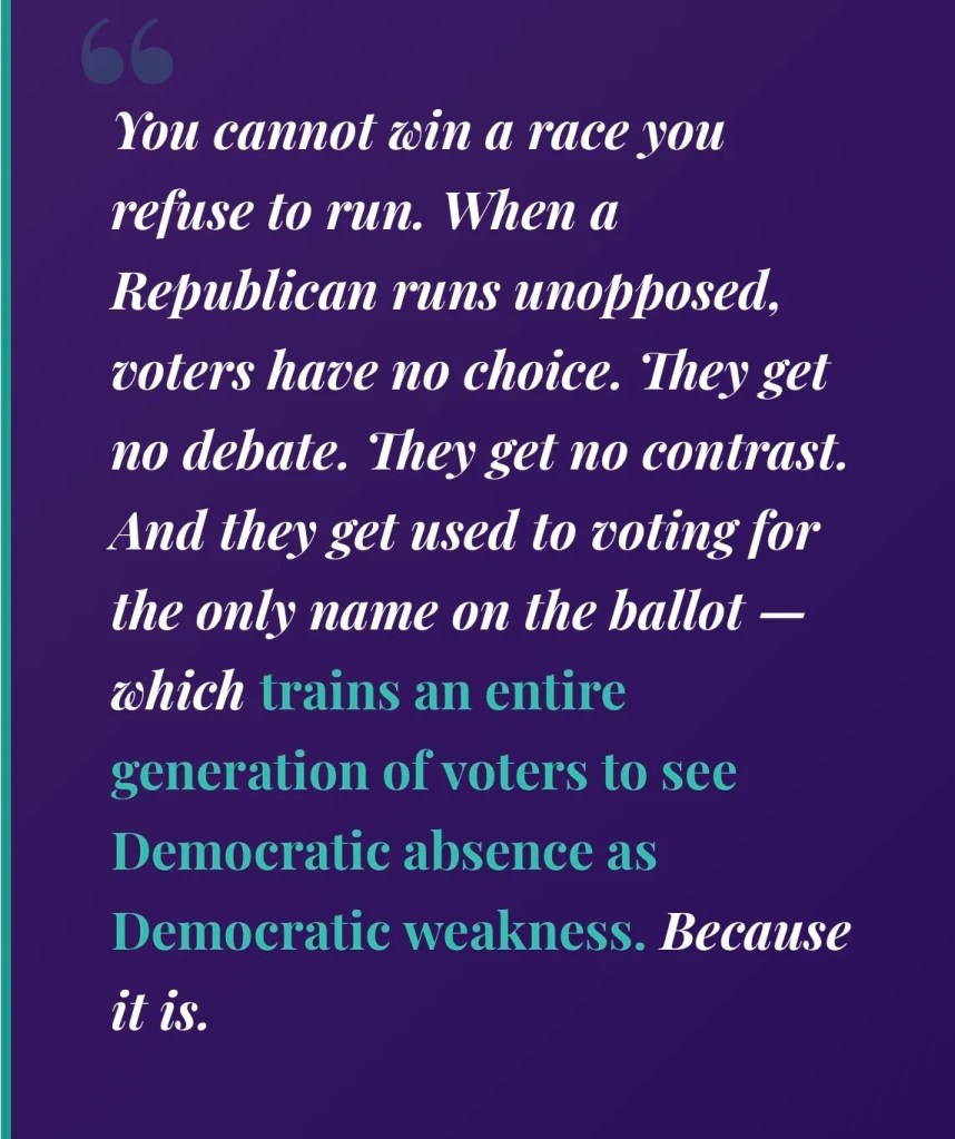
But these charts aren’t only for GOP voters. This one is for Kentucky Democrats overall:

Leave a comment